Key Date Coin List
As promised, here is the gateway page to the Key Date Coin List (If you prefer, you can skip these introductory formalities and head directly to the list a few paragraphs below).
Before proceeding, let’s make sure we’re all on the same wavelength. What is meant by "key date" coin? This Rare Coins 101 Axiom provides a definition:
A key date coin is a coin of relative scarcity popularly sought by collectors. There is a limited supply to meet demand, usually driving prices higher and faster over time compared to its collectible common date counterparts.
For many of us, key date coins are the cream of the crop in United States numismatics -- the pick of the litter, the cat’s meow, or whichever metaphor you prefer!
In reality, only a few key date coins can boast of especially glorious value appreciation narratives. Furthermore, they are fundamentally positioned for future repeat performances (required disclaimer: past success is not an absolute guarantee of forthcoming trends, but it sure is a good indicator!).
The primary objective of Rare Coins 101 is to itemize key date coins with awesome value trend histories. These coins are recommended for buyers seeking numismatic material poised to enjoy impressive price increases in the years ahead. These recommendations are not merely crystal ball predictions: They are based strictly on performance over the last several decades.
All coins on the recommendation list have three things in common: 1) They are relatively rare in just about any grade, 2) have been wildly popular with collectors for generations, and 3) are connected to fascinating historical accounts.
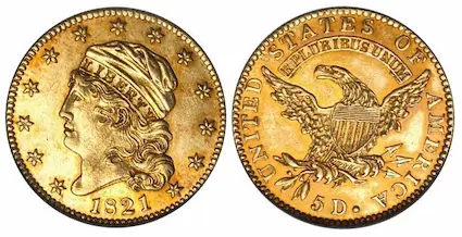
Why, here’s one of them right now...

The first section below introduces the Key Date Coin List and defines the various performance categories within the list (GOOD, BETTER, BEST, and Classic Rarities). Every listing is linked to an in-depth value trend analysis, characterized by historical charts, photos, and descriptions.
Although they’re easily self-guided, you’ll find an explanation on how to utilize the chart features. As you peruse through the charts, there are a few points to keep in mind while you're doing so, and we'll cover those in a few minutes. What’s more, there is a “live” interactive chart sample below for you to check out.
As is always the case when coin collectors are around, there are curious intellectuals who want to “look under the hood” in order to understand the subject matter in greater detail. For them, there’s a bonus discussion explaining the method employed to select the coins making the cut and how the underlying chart data was researched, calculated, and charted.
Full transparency, you might say.
It is not necessary to digest the bonus material in order to benefit from the Key Date List of Recommendations -- it's totally optional on your part.
And finally, there are a few words of wisdom on becoming a devoted numismatist. It’s more important than many realize.
It’s time to get started…
- Key Date Coin List
- Sample Chart
- Things to Keep in Mind While Using the Chart
- How Selected Coins Made the Cut
- How the Data was Researched
- Become a Devoted Numismatist
- PDF Reports
Key Date Coin List
The Key Date Coin List is comprised of coins demonstrating relatively high percentage value increases compared to most other collectible coins, as calculated from 1990 onward (although we do have charts displaying price data going back to 1950).
The list is broken up into three groups, based on the level of past performance. The groups are GOOD, BETTER, and BEST. In addition, an honorary category called Classic Rarities is also submitted for your consideration.
To assist with identification, there is a color associated with each group. Various shades of green are connected with the GOOD, BETTER, and BEST groups, while yellow is the color for Classic Rarities.
The GOOD Group
Coins in the GOOD group have enviable records of price increases, well above those of ordinary collectible coins. Proud buyers of these coins should be confident they’ll be able to sell at a much higher price someday.
As solid as these coins are, their potential for sensational price advances is somewhat less than the BETTER or BEST groups, but at least you're more likely to have an easier time finding an example for sale. Notably, many of the coins in the GOOD group are within the affordability range of average collectors (but they ain’t necessarily cheap, either!).
The BETTER Group
As the name implies, coins in the BETTER group have outpaced the GOOD group in terms of percentage gains over the same period of time. With this group, true rarity is confronted by consistently powerful demand, forcing prices higher and at a faster rate than all other coins, with the exception of but a few.
Acquiring dates from this group may require patience and diligent searching, attesting to their limited availability and fierce competition from buyers.
The BEST Group
The smallest number of coins qualified for the BEST group. As the charts illustrate, their value Trendlines are the steepest of all the coins surveyed (more about Trendlines shortly).
Due to many years of accelerated growth, quite a few of them are priced beyond the budget of modest collectors (but not all!). It’s not impossible, but for most of us, bringing home one of these numismatic titans requires financial planning, commitment, and patience.
Even coins from this group are susceptible to cyclical price reductions and stagnation spells. Over the long haul, however, enjoy the ride because their increasing valuations are based on durable collector fundamentals.
The Classic Rarities Group
Coins belonging to the Classic Rarities group merit well-deserved honors. These are coins readily recognizable as key date issues, but whose value trends since 1990 failed to place them in one of the three recommended green groups above (although many did not miss by much).
A perfect example is the 1909-S VDB Lincoln cent. This is often one of the first coins a collector learns about upon getting started in the hobby and is absolutely one of the most important dates in the long-running Lincoln cent series.
The 1909-S VDB has a very long record of dramatic price increases, reaching its last peak in 2009. Since then, prices have waned to the point where the venerable coin’s overall trends preclude it from qualifying in one of the green groups.
The Classic Rarities membership reads like a “Who’s Who” of numismatics. Although their prices may have stabilized or fallen in recent years, they’re still craved by collectors and have far greater potential to outperform common date coins.
Most of them are relatively affordable, so there’s some happy news. Hint: Might be an excellent time to purchase a few of these legacies while at a discounted cost. At some point they’ll inevitably catch another wave of surging prices and bump up into a green category.

Sample Chart
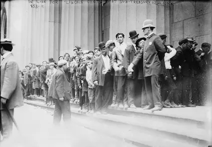
Below is a “live” sample chart from one of the coins in the BEST group, the 1821 Capped Head $5 Half Eagle.
We say it is “live” because you can click on the legend to move around and view other charts for the coin.
There are up to seven separate charts for any given coin, all accessible through the legend. Also, the charts are interactive: Hover over the plot area on any chart to sink your teeth into the data.
Historic Value Trend Charts:
Chart Features
Value Trends by Grade: The first three to five charts depict value changes from 1990 to the present for various coin grades (e.g., F-12, VF-20, etc.).
Trendline slope: This is a visual indicator of the coin’s long-term value trend performance. The steeper the Trendline slope (and hence, a bigger slope number), the more powerfully the coin has gained in value. Although the grade charts are documenting dollar value movements, the Trendline is computed based on the percent changes of those same dollar movements. This allows for an “apples-to-apples” comparison from one chart to the next and from one coin to the next. For those interested, the Trendline computation method is explained in a footnote at the bottom of the page (lace up your math shoes!).
Grade % Comps: This is the grade percentage comparisons chart, which tracks the percent movements on an annual basis since 1990 for the grades studied. It’s another quick way to evaluate how the grades stack up against one another for percentage gains. The year 1990 is the baseline and assigned a value of 100. Dollar price changes are translated as a percentage of the baseline value. For example, a price rise of 25 percent is charted as 125%. A 15% drop in value from the baseline would be shown as 85%.
$ Trends 1950-1990: Data-hungry researchers have the opportunity to review value trends all the way back to 1950. Simply hover over any year to observe prices in that year for a variety of grades. Spend some time here and you’ll discover the coins that did well way back then are much the same “leader of the pack” coins today. You’ll also confirm roller coaster cycles are nothing new.
Calculate Rate of Return: Some buyers prefer to consider the past annualized compounded Rate of Return (ROR) percentage for certain coins, to compare it with the returns of other coins or investments. This type of yardstick is common in the financial world. While this site does not tout rare coins as a top-notch investment, for the convenience of those who carefully study compounded percentages, there is a "Calculate ROR" button just below charts for every coin included in this study. Just click the button and a small window comes open, whereupon you feed it some numbers.
Here is a "Calculate ROR" button for you to try out:
Things to Keep in Mind While Using the Charts
As you go about utilizing the charts, there are several things to keep in mind…
Watch Those Trendlines!
The Trendline and slope number were calculated and prominently displayed on every grade price performance chart, of which there are three to five for every coin. The average of these inputs became the Trendline slope number associated with the coin date, and was the final arbiter to determine what group, if any, the coin would be assigned to (more on this methodology below).
The Trendline slope number makes it very easy to compare and contrast a coin’s prevailing value trend direction. As previously stated, the steeper the Trendline and bigger its slope number, the more exceptional was the coin’s price increases.
Every single coin assigned to the GOOD, BETTER, or BEST groups, exhibits Trendline slopes markedly greater than any common date collectible coin similarly studied and charted.
Compare Key Date Recommendations to Common Dates
Contained within the analysis for every recommended coin is a link to an identically constructed chart for a common date coin of the same type. The value appreciation patterns, as reflected by the Trendline slopes, are usually dramatically different.
Trendlines for common dates run uphill at a lesser clip, while those for the coins belonging to the GOOD, BETTER, and BEST groups tower above their common date siblings.
Grades Chosen for Charting
The grades charted in this study were mostly through the heart of the 70-point coin grading spectrum. Although it was not always possible due to lack of data availability, the majority of grades charted are F-12 to MS-60. There are no charts for anything higher than MS-65.
This was done to avoid the potential skewing of the Trendline average computation many high-grade coins might cause. For example, the 1926-S Lincoln cent is a rather ordinary coin, but MS-65 Red specimens can bring $100,000,(3) which is at least 10 times more than in the 1990s.(4)
The example given is what we call a “Condition Rarity” coin -- a common date coin that is very rarely found in a high grade.
Note: Coins issued in Proof-only condition were included in our survey and do appear in the recommendations.
The goal of this site is not to point out Condition Rarity coins… it is to identify coins that are rare in ANY grade AND that have been eagerly sought by generations of collectors.
Don’t Frown Upon Lower Grade Coins
With the exception of early United States coins (especially coppers), there are not many charts for coins graded About Good, Good, or Very Good.
Charts for lower grade coins were not omitted because they are to be frowned upon. There is absolutely nothing wrong with buying lower grade coins. Any heavily worn example from the Key Date Coin List would be an excellent acquisition. Not only are they more affordable, but they demonstrate price trends just as good if not better than higher grade coins of the same date.
If you have your sights set on a rare date in low grade, put forth the extra effort to find a problem-free coin of good eye appeal. Actually, this advice is true for any grade, but coins at the bottom end of the grading scale do tend to display more damage and other undesirable effects, so be patient until the right coin comes along. You'll be glad you did.
Why 1990 was Chosen as the Baseline
There are several reasons why the year 1990 was chosen as the baseline for this study:
- The dates appearing on the Key Date Coin List didn’t get there because of value trends observed over the last few years only. In order to identify coins with true staying power, a wider body of data covering a span of at least 30 years is necessary, leading us directly to the next bullet point…
- It is rather common to see coins fluctuate in value, even for the scarcest dates of high demand. There may be a period of years when prices are hot and rising, only to be followed by a cooling off duration marked by eroding values. Had we studied a shorter horizon, there may not have been enough time for a coin to complete a full up-and-down cycle. A period of 30+ years was deemed ample time to allow any cycle to play out.
- Greater consistency in grading. Prior to the start-up of PCGS and NGC third-party grading services in 1986 and 1987 respectively, coin collecting was plagued by inconsistent and faulty grading. One person’s Extremely Fine-40 might be confused for someone else’s About Uncirculated-50. Naturally, this played havoc with price guide publications of those days as well. By 1990, grading consistency had taken a giant leap forward, so we can look back on the accuracy of pricing guides from that time onward with greater confidence. This is not to say grading standards have remained perfectly stable since then – they have been known to veer subtly, most notably for grades above MS-60, but things are much better now than before.
Actually, Rare Coins 101 provides value trends all the way back to 1950. This data is accessible through the $ Trends 1950-1990 link located on the right-hand side of the chart legend. The stats may be a bit sketchy in places, but there’s plenty of information there to investigate, nonetheless. You’ll notice the same coins that increased dramatically in value since 1990 were much the stars of the show long before that.
Extreme Rarities NOT Included in This Study
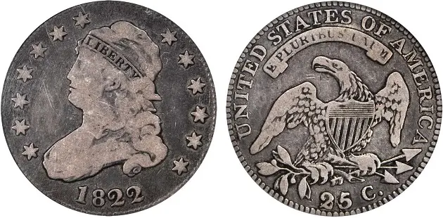
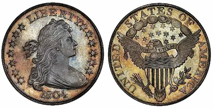
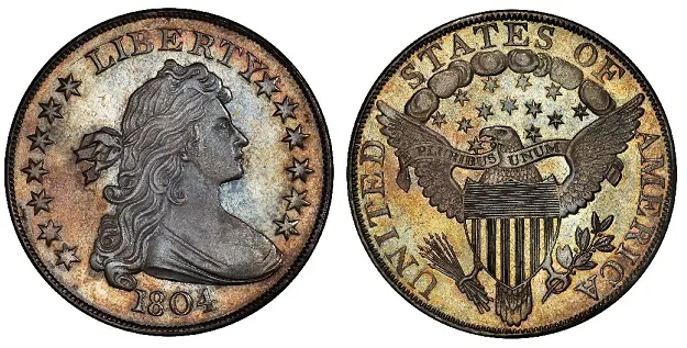
Incredibly rare coins worth millions of dollars, such as the 1804 Draped Bust silver dollar, 1822 Capped Head $5 half eagle, 1894-S Barber dime, or the 1913 Liberty nickel are NOT included in this study. The reason for this is twofold:
- They’re traded very infrequently due to their extreme rarity, making it difficult to gather sufficient data for constructing value trend charts.
- How many among us has millions to spend on a single coin?
However, there is a great deal of lore and glamour attached to famous, super expensive coins. The publicity they generate does influence the coin collecting hobby in a positive manner. That’s why we have a Top 15 Most Valuable Coins chapter.
How Selected Coins Made the Cut
The universe of offerings in United States coin collecting is extensively broad. There are literally thousands of collectible coin dates for sale at any moment.
What methodology was employed to isolate the coins holding the greatest promise (based on past performance) for reselling at a much higher price? Let’s take it step-by-step:
- Accumulate published coin retail price data spanning many decades. I – Webmaster Dan Goevert speaking here – have been fascinated with studying price movements of coins since I was a kid back in the 1960’s. I’ve lugged around heavy totes of old coin books and magazines for most of my life.
- Enter annual price data going back to 1990 into spreadsheets for a comprehensive representation of collectible U.S. coins (this is where it helps to be an experienced collector). Develop a time series bar chart for at least three but not more than five grades (F-12, VF-20, etc.) for every coin included in the study.
- For each bar chart, compute value percentage changes from year to year. Use this information to calculate Trendline slopes from 1990 to the present, as a quick visual indicator of overall direction and rate of price shifts. More on Trendline and slope math computations HERE.
- Calculate the average of the Trendline slope numbers for the grade charts for each individual coin date. Going forward, the average becomes the Trendline slope associated with that particular coin.
- Conduct a comparative analysis, searching for coins with Trendlines steeper than the vast majority of other collectible coins contained within the study.
- The coins emerging from Step 5 made the cut. They are included on the Key Date Coin List of recommendations because of their demonstrated long-term popularity with coin buyers, pushing their prices higher and faster than most other coins. Coins with Trendline slopes of 13.00 to 17.99 were placed in the GOOD group. Those scoring 18.00 to 29.99 deserved a promotion to the BETTER group. Anything 30.00 or higher was admitted to the hallowed ground of the BEST group (admittedly, these parameters were set arbitrarily, but boundaries had to be set somewhere).
The numismatic rarities qualified to make the cut are filtered out and listed for your convenience via the gateway links above. All the difficult and tedious legwork has already been done for you!
Researching decades of pricing data, crunching trend lines & percentages, and identifying historically key date coins with the greatest potency for price increases is the essence of Rare Coins 101.
How the Data was Researched
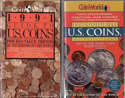
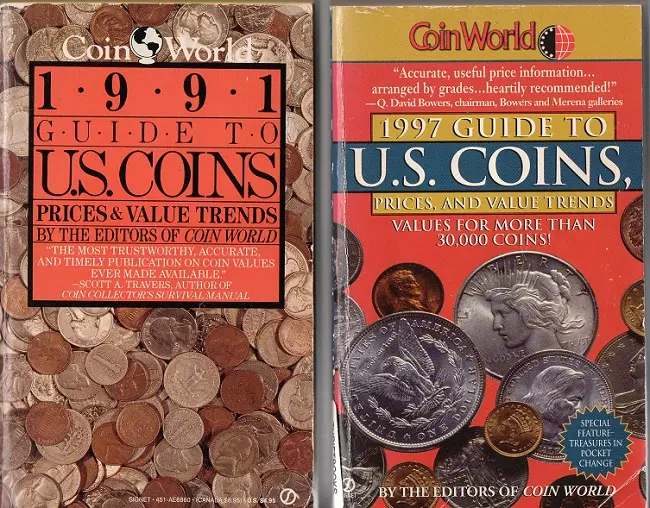
The majority of coin values reported on this site from 1990 onward came from what is today called Amos Media (the Coin World folks). They’ve been publishing estimated retail coin prices since 1960 and are a hugely trusted source of information within the numismatic community.
Occasionally, there were gaps in the Amos material. When this occurred, the historical records of other companies were researched to help fill in the blanks. These included Krause Publications (doesn't exist anymore, but Numismatic News is still around), PCGS, and Numismedia. All are excellent at what they do.
This explains where the data came from to create most of the charts and Trendlines presented on Rare Coins 101.
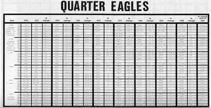
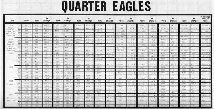
The value trends researched from 1950-1990 were quite another story...
Thank goodness for the vast holdings of the American Numismatic Association library. Reference materials used to construct these value trends included vintage advertisements, auction results, and a variety of numismatic periodicals and other publications from the year 1950 to 1985.
The "Redbook" was the most important source mined for historic coin values. Debuting in 1946, the popular reference in its earlier years was somewhat sketchy by today's standards (i.e., not many coin grades reported), but provided a good foundation to build upon.
I first started publishing my research in 1987 when the book Value Trends of United States Coins was released. Last time I checked, it was still available on Amazon, though obviously badly outdated.
Become a Devoted Numismatist
It is my hope here at Rare Coins 101 that you’ll spend some quality time soaking in more than just numbers and percentages. United States coinage is filled with a rich heritage worthy of detailed study. With that in mind, I’ve commingled historical tidbits and other points of interest about the coins recommended here, to complement the value trend charts.
It’s actually a smart strategy to become a devoted numismatist. By getting acquainted with the specifics, nuances, and legacies associated with U.S. coins, it gives you an added advantage to help you build a collection of extraordinary potential. What’s more, you’ll also experience joy, pride and other benefits that don’t register on the bottom line of a balance sheet!
Need a roadmap to guide your journey from beginner to top notch collector? There is a Getting Started in Coin Collecting section on this site to help you reach this destination.
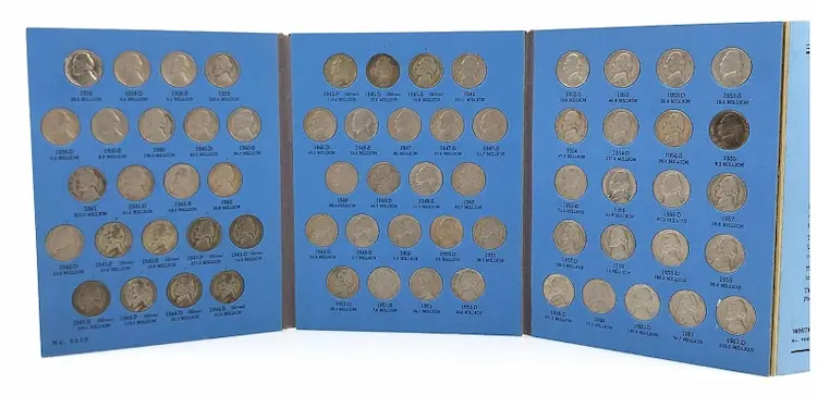
Many, if not most of us, started out really small, just like this guy did...
PDF Reports
Readers of Rare Coins 101 have full access to all value trend charts and recommendations at no charge. It is FREE! Not only that, but you also won't get mercilessly pounded with tons of utterly annoying ads or malware (but please forgive me for running a few ads).
I now have a place where you can download PDF coin reports. I don't have many reports ready just yet, but what is there is available at a modest cost. The PDF reports display the same data you can see online here for free, but from a different perspective. The main benefit to you is these reports may save you time researching.
On top of that, the reports will be formatted for handy storage on your device or for producing hard copy prints.


A Trendline is a line that indicates the overall pattern, or trend, of a data set. It is sometimes called the Line of Best Fit. A Trendline makes it visually easier to identify and quantify the pattern, if one is present, associated with the data set.
Trendlines may also be used to predict future data points.
Constructing a Trendline usually starts with a two-dimensional graph of ordered pairs, often depicted by a scatterplot. Along the horizontal, or x-axis, are the “independent” variables. These could be units of time or distance a runner jogs, for example. Along the vertical, or y-axis, are the “dependent” variables, and might be declared in terms of dollars or minutes. Here is a scatterplot illustrating the fluctuating value of an investment over time:
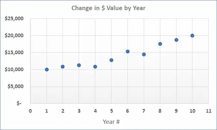
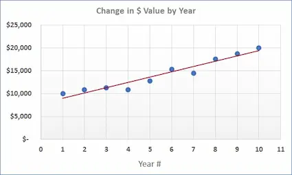
The next step is to draw a straight line through the field of plotted points, with the goal of situating the line as close as possible to each point, while keeping the number of points falling above and below the line about equal. This line is the Trendline. In the chart below, the dark red line is the Trendline for this set of data points.
Today, we normally use computers to calculate and draw the path of the Trendline using the least squares method.
Thinking back to high school math class, a linear (i.e., straight) line can be expressed by the equation:
y = mx + b
where x is the independent variable, y is the dependent variable, m is the slope of the line, and b is where the line intercepts the y-axis.
Because Trendlines are straight lines, they too can be expressed by the y = mx + b equation.
What, exactly, does the slope m represent? The slope of a line is the change in y (moving up or down) generated by a one unit increase in x (moving to the right).
For the data set in the example chart below, the equation for the Trendline is y = 1150.9x + 7850. If the past trend is carried forward, this equation can be invoked to estimate the value of this investment in future years.
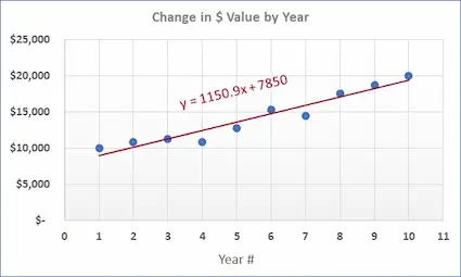
The slope tells us the nature of the relationship between the independent and dependent variables. If the slope is a positive number, there is a positive association between the variables (e.g., a key date coin increasing in value over time). A negative slope indicates a negative association between the variables (e.g., decreasing speed in the 40-yard-dash with increasing adult age). A slope close to zero means there is very little, if any association between the variables (e.g., the ounces of water drank daily in relation to the number of letters in last names -- a silly example, but it gets the point across).
Consider the positive association… bigger slope numbers create steeper upward Trendlines, signifying values along the y-axis are rising at a faster rate compared to smaller slopes and flatter Trendlines.
Rare Coins 101 has charted a large number of United States coins in a variety of conditions. Slopes and Trendlines for every coin studied were calculated and compared, as exemplified on the sample chart above. Coins with larger slopes and steeper Trendlines were shown to have increased in value at a faster pace than coins with smaller slopes and flatter Trendlines. These coins formed the core of our Key Date Coin List of recommendations.
A Trendline is a line that indicates the overall pattern, or trend, of a data set. It is sometimes called the Line of Best Fit. A Trendline makes it visually easier to identify and quantify the pattern, if one is present, associated with the data set.
Trendlines may also be used to predict future data points.
Constructing a Trendline usually starts with a two-dimensional graph of ordered pairs, often depicted by a scatterplot. Along the horizontal, or x-axis, are the “independent” variables. These could be units of time or distance a runner jogs, for example. Along the vertical, or y-axis, are the “dependent” variables, and might be declared in terms of dollars or minutes. Here is a scatterplot illustrating the fluctuating value of an investment over time:
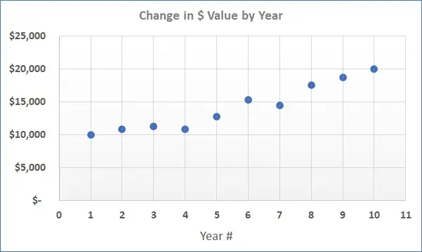
The next step is to draw a straight line through the field of plotted points, with the goal of situating the line as close as possible to each point, while keeping the number of points falling above and below the line about equal. This line is the Trendline. In the chart below, the dark red line is the Trendline for this set of data points.
Today, we normally use computers to calculate and draw the path of the Trendline using the least squares method.
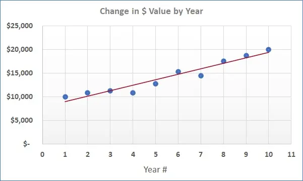
Thinking back to high school math class, a linear (i.e., straight) line can be expressed by the equation:
y = mx + b
where x is the independent variable, y is the dependent variable, m is the slope of the line, and b is where the line intercepts the y-axis.
Because Trendlines are straight lines, they too can be expressed by the y = mx + b equation.
What, exactly, does the slope m represent? The slope of a line is the change in y (moving up or down) generated by a one unit increase in x (moving to the right).
For the data set in the example chart below, the equation for the Trendline is y = 1150.9x + 7850. If the past trend is carried forward, this equation can be invoked to estimate the value of this investment in future years.
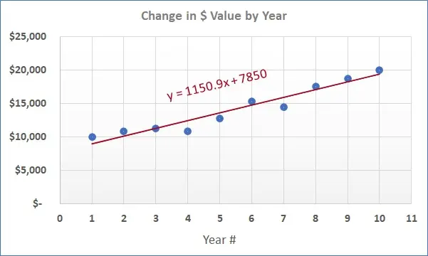
The slope tells us the nature of the relationship between the independent and dependent variables. If the slope is a positive number, there is a positive association between the variables (e.g., a key date coin increasing in value over time). A negative slope indicates a negative association between the variables (e.g., decreasing speed in the 40-yard-dash with increasing adult age). A slope close to zero means there is very little, if any association between the variables (e.g., the ounces of water drank daily in relation to the number of letters in last names -- a silly example, but it gets the point across).
Consider the positive association… bigger slope numbers create steeper upward Trendlines, signifying values along the y-axis are rising at a faster rate compared to smaller slopes and flatter Trendlines.
Rare Coins 101 has charted a large number of United States coins in a variety of conditions. Slopes and Trendlines for every coin studied were calculated and compared, as exemplified on the sample chart above. Coins with larger slopes and steeper Trendlines were shown to have increased in value at a faster pace than coins with smaller slopes and flatter Trendlines. These coins formed the core of our Key Date Coin List of recommendations.
Sources
1. Gibbs, William T., et al. 1991 Guide to U.S. Coins. New York, NY. Penguin Putnam Publishing, 1990.
2. Gilkes, Paul, Senior Editor, U.S. Coins. Coin World Domestic Values. Sidney, OH. Amos Media Company. 2026.
3. Gilkes, Coin World Domestic Values.
4. Gibbs, 1991 Guide to U.S. Coins.
5. Stack's Bowers Galleries. The Sultan of Muscat-Watters-Brand-Childs-Pogue 1804 Dollar. August 2021.
